Typography
Typography components expose semantic text styles through AppTheme.typography and AppText.
Components
AppTextAppTextStyle
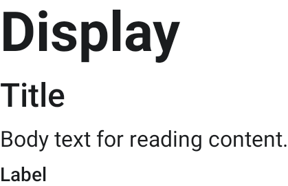
Example
AppTheme {
    AppText(
        text = "Dashboard",
        style = AppTextStyle.Title,
    )
}
Use semantic styles rather than ad-hoc font sizes in app UI.
Styles
AppTextStyle covers the original 4-slot scale (Display, Title, Body,
Label) plus the AppTypography weight-variant slots — a Material 3 base slot
re-cut heavier, on-scale — so emphasis does not need an inline
style.copy(fontWeight = …):
AppText(text = "Selected", style = AppTextStyle.BodyLargeSemibold)
Weight-variant roles: LabelSmallSemibold, LabelSmallBold,
LabelMediumSemibold, LabelMediumBold, LabelLargeBold, BodySmallMedium,
BodySmallSemibold, BodyMediumSemibold, BodyLargeSemibold. See
Theming → Typography slot taxonomy.