Navigation
Navigation components provide themed Material 3 wrappers for common app structure.
Components
TopAppBarMediumTopAppBarLargeTopAppBarTabBarTabRowNavRailAdaptiveNavScaffoldPaginatedContentSegmentedContent
TabBar
A bottom navigation bar for switching between top-level destinations. Selection is driven by
a caller-owned value (selection/onSelectionChange) rather than list position, so reordering
items never changes which destination is selected — closer to SwiftUI's TabView(selection:)
than a plain index.
AppTheme {
    TabBar(
        items = items, // List<TabBarItemData<Destination>>
        selection = selection,
        onSelectionChange = { selection = it },
    )
}
TabBarItemData.icon and label are full composable slots, not raw ImageVector/String
params, so badges, selected-icon swaps, or any custom rendering fall out of the slot API with
no extra parameters needed:
TabBarItemData(
    value = Destination.Home,
    icon = { Icon(Icons.Filled.Home, contentDescription = null) },
    label = { Text("Home") },
    badge = { Text("3") },
)
Use arrangement = TabBarArrangement.Centered to group destinations in the horizontal center
of the bar (sized to content) instead of the default EqualWeight (every destination fills
equal width — the common 3–5 destination case).
For full control over individual items — e.g. per-item composition a plain data model can't
express — use the primitive overload with TabBarItem calls inside content:
TabBar {
    TabBarItem(value = Destination.Home, selection = selection, onSelectionChange = { selection = it }, icon = { ... })
    TabBarItem(value = Destination.Account, selection = selection, onSelectionChange = { selection = it }, icon = { ... })
}
Scroll-to-hide
Pass a scrollBehavior (from rememberTabBarScrollBehavior()) to have the bar hide itself as
the caller's scrollable content scrolls down, and reappear on scroll up. Attach the same
behavior's nestedScrollConnection to that scrollable content:
val scrollBehavior = rememberTabBarScrollBehavior()

LazyColumn(modifier = Modifier.nestedScroll(scrollBehavior.nestedScrollConnection)) { ... }

TabBar(
    items = items,
    selection = selection,
    onSelectionChange = { selection = it },
    scrollBehavior = scrollBehavior,
)
NavRail / AdaptiveNavScaffold
NavRail and AdaptiveNavScaffold share TabBarItemData/TabBarItemColors with TabBar, so
a rail and a bar built from the same items stay visually consistent. AdaptiveNavScaffold
shows a TabBar on compact screens (< 600 dp wide) and a NavRail on medium/expanded screens;
scrollBehavior only applies to the compact-width TabBar — the rail stays persistent.
AppTheme {
    AdaptiveNavScaffold(
        items = items,
        selection = selection,
        onSelectionChange = { selection = it },
        topBar = { TopAppBar(title = "Dashboard") },
    ) { innerPadding ->
        // Your screen content here
    }
}
Navigation state is owned by the caller. Pass callbacks instead of navigation controllers to keep components reusable.
PaginatedContent
A horizontally-paged container with a clickable title row and optional page indicator. Similar to Play Store app sections.
AppTheme {
    PaginatedContent(
        pages = listOf(
            PaginationPage(title = "Popular"),
            PaginationPage(title = "New"),
            PaginationPage(title = "Top Rated"),
        ),
    ) { pageIndex, page ->
        // Your page content here
        Text(text = page.title)
    }
}
Custom title slots are supported via the pageTitle parameter. For external page control, pass a caller-owned PagerState.
On first composition PaginatedContent plays a brief peek-and-return animation to signal that the content is horizontally scrollable. Suppress it with showScrollHint = false when scrollability is already obvious:
PaginatedContent(
    pages = pages,
    showScrollHint = false,
) { _, page ->
    Text(text = page.title)
}
Inactive page titles are dimmed using the theme outline color to match the de-emphasis level of the dot indicators, and the title row mirrors correctly under right-to-left layout direction.
SegmentedContent
A tap-driven segmented picker paired with a client-supplied content slot. Tapping a segment crossfades to that segment's content. When segment titles fit the available width they distribute evenly; when they overflow, the bar becomes horizontally scrollable and shows a soft edge fade on whichever side has more to reveal. Scrolling the selection into view also keeps a sliver of the adjacent segment peeking, so it stays obvious there's more to either side.
Reach for SegmentedContent when selection should be discrete and tap-driven (settings sections, filter modes). Reach for PaginatedContent when the user should be able to swipe between full-width pages of content.
State-managed overload (the component owns the selection):
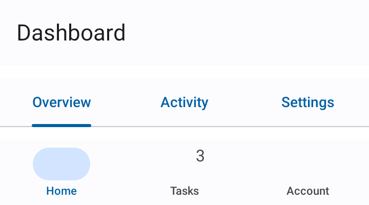
AppTheme {
    SegmentedContent(
        items = listOf(
            SegmentedItem(title = "Overview"),
            SegmentedItem(title = "Activity"),
            SegmentedItem(title = "Settings"),
        ),
    ) { _, item ->
        Text(text = "${item.title} content")
    }
}
State-hoisted overload with a custom title slot:
var selectedIndex by remember { mutableIntStateOf(0) }
SegmentedContent(
    items = items,
    selectedIndex = selectedIndex,
    onSelectionChanged = { selectedIndex = it },
    indicator = SegmentSelectionIndicator.Underline,
    fitMode = SegmentFitMode.Intrinsic,
    segmentTitle = { _, item, isSelected ->
        // any composable — icons, badges, multi-line, etc.
    },
) { _, item ->
    SectionContent(item)
}
Use SegmentSelectionIndicator to choose between Pill (filled background, iOS-segmented feel), Underline (Material-tab feel), or None (style entirely through the title slot). Use SegmentFitMode.EvenWhenFits for distribute-evenly-or-scroll behavior, or SegmentFitMode.Intrinsic to always size segments to their content.