Actions
Action components wrap Material 3 controls with AppTheme colors, spacing, and minimum touch targets.
Components
PrimaryButtonSecondaryButtonTextButtonIconButtonFABExtendedFloatingActionButtonSegmentedControlSingleChoiceSegmentedButtonRowPillChip
Example
AppTheme {
    SecondaryButton(
        text = "Back",
        onClick = ::goBack,
    )
}
Icon-based actions require a non-null contentDescription unless the icon is purely decorative.
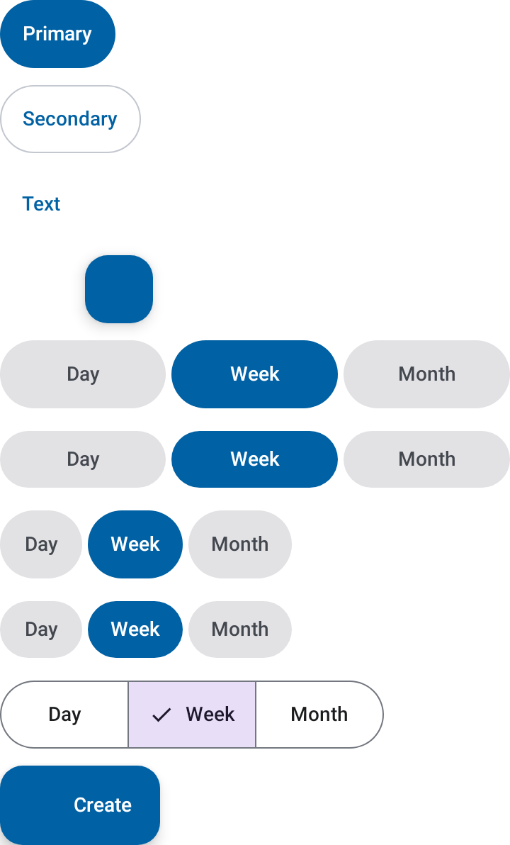
PillChip
PillChip is a capsule-shaped tappable chip that toggles between a selected and
unselected visual state. Typical use cases are filter rows, level selectors, and
persistent multi-option toggles.
AppTheme {
    Row(horizontalArrangement = Arrangement.spacedBy(AppTheme.spacing.x1)) {
        PillChip(label = "All", isSelected = true, onClick = {})
        PillChip(label = "Beginner", isSelected = false, onClick = {})
        PillChip(label = "Advanced", isSelected = false, onClick = {})
    }
}
Defaults pull colors from AppTheme.colors so the chip picks up the surrounding theme
automatically. Override selectedBackground, unselectedBackground, selectedLabel,
and unselectedLabel when a specific tint is needed — for example, per-level filter
capsules that reuse a LevelPalette tier.
Parameters
| Parameter | Type | Description |
|---|---|---|
label |
String |
Chip text. |
isSelected |
Boolean |
Whether the chip renders in its selected state. |
modifier |
Modifier |
Applied to the chip container. |
onClick |
(() -> Unit)? |
Invoked on tap. Leave null to render a static, non-interactive badge — no touch target, no click semantics. |
selectedBackground |
Color |
Background when selected. Defaults to AppTheme.colors.primary. |
unselectedBackground |
Color |
Background when unselected. Defaults to AppTheme.colors.primaryContainer. |
selectedLabel |
Color |
Label color when selected. Defaults to AppTheme.colors.onPrimary. |
unselectedLabel |
Color |
Label color when unselected. Defaults to AppTheme.colors.onSurface. |
PillChip as a tier badge
A second PillChip overload renders a static, non-interactive badge tinted with a
LevelTier from a LevelPalette. Use it for tiered indicators — skill level,
difficulty, priority, and similar categorical scales — where the tint encodes the
tier and the label spells it out.
AppTheme {
    Row(horizontalArrangement = Arrangement.spacedBy(AppTheme.spacing.x1)) {
        PillChip(label = "Beginner", tier = AppTheme.colors.levels.tier(0))
        PillChip(label = "Advanced", tier = AppTheme.colors.levels.tier(1))
        PillChip(label = "Expert", tier = AppTheme.colors.levels.tier(2))
    }
}
Callers typically read a tier via AppTheme.colors.levels.tier(level.ordinal) and pass
it here, decoupling the badge from the app's own level taxonomy. LevelPalette ships
empty by default — supply your own tiers (background + foreground color pairs) when
building AppTheme.
Parameters
| Parameter | Type | Description |
|---|---|---|
label |
String |
Badge text. |
tier |
LevelTier |
Background/foreground color pair for this tier. |
modifier |
Modifier |
Applied to the badge container. |