Feedback
Feedback components communicate loading, transient status, and placeholder states.
Components
ProgressIndicatorSkeletonSkeletonBlockModifier.skeletonShimmerToastToastHostChatLogAssistantContextCardAssistantQuickActionChipsAssistantStatusBannerAssistantLimitPromptCardAssistantDisclaimerFooter
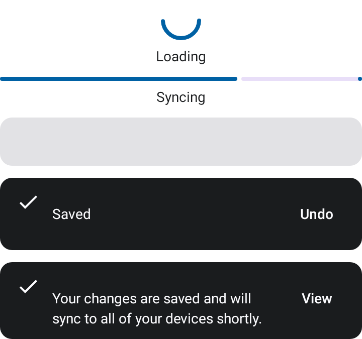
Example
AppTheme {
    ProgressIndicator(
        progress = state.progress,
        label = "Syncing",
    )
}
Use progress = null for indeterminate loading. Toast is an in-composition visual component, not a platform android.widget.Toast wrapper.
Chat logs
ChatLog renders reusable conversation bubbles with user/assistant alignment,
typing indicator state, and a retryable error bubble. Keep domain models in your
app and map them into ChatMessage values at the UI boundary:
ChatLog(
    messages = state.turns.map { turn ->
        ChatMessage(
            id = turn.id,
            sender = ChatMessageSender.Assistant,
            state = ChatMessageState.Content(turn.text),
        )
    },
    idleHint = "Ask a question to get started.",
    typingDescription = "Assistant is responding",
    errorAction = ChatErrorAction(
        message = "Could not load the response.",
        retryLabel = "Retry",
        onRetry = onRetry,
    ),
)
Use ChatMessageState.Typing for in-flight responses and provide a localized
typingDescription so the state is announced accessibly. For markdown or rich
text, pass messageContent; the design-system component intentionally does not
depend on a markdown renderer:
ChatLog(
    messages = messages,
    idleHint = "",
    errorAction = errorAction,
    messageContent = { _, text ->
        MarkdownText(markdown = text)
    },
)
Assistant chat surfaces
For quick-action assistant experiences, compose the chat log with the surrounding assistant components:
Column {
    AssistantStatusBanner(message = unavailableMessage)

    AssistantContextCard(
        title = contextTitle,
        highlight = contextHighlight,
        body = AssistantContextBody(text = sourceText, isQuoted = true),
        footnote = contextFootnote,
    )

    ChatLog(
        messages = messages,
        idleHint = idleHint,
        errorAction = errorAction,
        modifier = Modifier.weight(1f),
    )

    AssistantQuickActionChips(
        actions = actions,
        actionState = { action ->
            AssistantQuickActionState(
                isSelected = action in usedActions,
                isEnabled = serviceAvailable && !isResponding && action !in usedActions,
            )
        },
        label = { action -> action.label },
        icon = { action -> action.icon },
        onAction = onAction,
    )

    AssistantDisclaimerFooter(text = disclaimer)
}
AssistantQuickActionChips is generic over the action type, so apps can reuse it
for one-shot actions, re-runnable actions, selected/in-flight actions, or disabled
quota states. icon is optional and defaults to no leading icon per action.
AssistantLimitPromptCard covers quota, upgrade, and gated-action prompts with
caller-supplied copy and callbacks.
Skeleton loading placeholders
Skeleton renders a single full-width placeholder block sized to a minimum touch
target height — a quick ghost row for simple loading states. For finer control (an
explicit height, an optional fixed width, or a custom shape/color to mimic the real
content it stands in for), use SkeletonBlock directly:
AppTheme {
    Column(verticalArrangement = Arrangement.spacedBy(AppTheme.spacing.x1)) {
        SkeletonBlock(height = 20.dp, width = 160.dp)
        SkeletonBlock(height = 16.dp)
    }
}
Both are decorative loading placeholders and are hidden from the accessibility tree
(clearAndSetSemantics {}) since they carry no information a screen reader should stop
on.
Shimmer
Modifier.skeletonShimmer() sweeps a soft highlight band across the placeholders below
it so a skeleton reads as in-progress rather than frozen. Apply it once at the root of
a ghost layout, not per block:
Column(
    modifier = Modifier.fillMaxWidth().skeletonShimmer(),
    verticalArrangement = Arrangement.spacedBy(AppTheme.spacing.md),
) {
    repeat(3) {
        Row(horizontalArrangement = Arrangement.spacedBy(AppTheme.spacing.md)) {
            SkeletonBlock(height = 48.dp, width = 48.dp)
            Column(Modifier.fillMaxWidth(), verticalArrangement = Arrangement.spacedBy(AppTheme.spacing.sm)) {
                SkeletonBlock(height = 16.dp)
                SkeletonBlock(height = 16.dp, width = 120.dp)
            }
        }
    }
}
The band's phase is a pure function of the animation frame clock, not per-node animation
state, so separate cards and lists that each use the modifier sweep in unison as one band
— regardless of when each entered composition. The highlight is
AppTheme.colors.shimmerHighlight (defaults to onSurface), painted at a low alpha and
masked with BlendMode.SrcAtop to the placeholder silhouette so it never tints the gaps.
The sweep is static — the modifier becomes an inert pass-through — when the system
reduce-motion / animator-duration-scale setting is off, when LocalSkeletonShimmerEnabled
is false (the escape hatch for deterministic screenshots), or under @Preview
inspection. It adds no pointer input and no semantics.
SkeletonBlock parameters
| Parameter | Type | Description |
|---|---|---|
height |
Dp |
Block height. |
modifier |
Modifier |
Applied to the block. |
width |
Dp? |
Fixed width; null expands to the constraints from modifier. |
shape |
Shape |
Clip shape. Defaults to AppTheme.shapes.small. |
background |
Color |
Placeholder color. Defaults to AppTheme.colors.surfaceContainer. |
Showing toasts
Toast is only the visual; ToastHost is the driver. Hold a ToastHostState,
place a ToastHost over your screen content, and call showToast from a
coroutine. It shows one toast at a time, animates it in and out, and suspends
until the toast is dismissed — returning how it ended (ToastResult).
Choose the lifetime per call with ToastDuration: Short/Long auto-dismiss
after a timeout, while Indefinite keeps the toast until the user or caller
dismisses it. An Indefinite toast with no action becomes tap-to-dismiss, so
pass dismissContentDescription for TalkBack.
Anchor the toast with position = ToastPosition.Top or ToastPosition.Bottom
(default). Pass an icon for a leading glyph; the icon is tinted to the surface
color by default — pass iconTint = Color.Unspecified to keep a colorful icon's
own colors.
val hostState = rememberToastHostState()
val scope = rememberCoroutineScope()

Box(Modifier.fillMaxSize()) {
    // …your screen content…

    PrimaryButton(
        text = "Save",
        onClick = {
            scope.launch {
                val result = hostState.showToast(
                    message = "Saved",
                    icon = AppTheme.icons.check,
                    actionLabel = "Undo",
                    duration = ToastDuration.Long,
                )
                if (result == ToastResult.ActionPerformed) {
                    // undo…
                }
            }
        },
    )

    ToastHost(
        hostState = hostState,
        position = ToastPosition.Bottom, // or ToastPosition.Top
        dismissContentDescription = "Dismiss",
    )
}