Containers
Container components provide themed layout surfaces and transient UI wrappers.
Components
CardFlipCardSurfaceSectionBottomSheetDialogSnackbarHorizontalDividerVerticalDividerOverlayCardAdaptiveContentContainerDisclosureCard
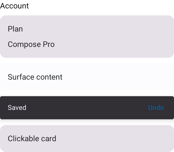
Example
AppTheme {
    Section(title = "Account") {
        Card {
            Text("Plan")
            Text("Compose Pro")
        }
    }
}
Prefer slot content for extensibility. BottomSheet, Dialog, and Snackbar are intentionally thin wrappers around Material 3 behavior.
FlipCard
FlipCard is a two-sided card that animates a 3D flip between a front and a back face — the building block for flash-card style UIs (vocabulary cards, quiz answers, reveal interactions). It is slot-based: each face is a @Composable BoxScope.() -> Unit, so you control the content entirely.
AppTheme {
    FlipCard(
        onClickLabel = "Flip card",
        frontStateDescription = "Showing question",
        backStateDescription = "Showing answer",
        front = { Text("What is Compose?") },
        back = { Text("A declarative UI toolkit.") },
    )
}
Controlled vs. uncontrolled
FlipCard supports both usage modes:
- Uncontrolled — omit
flipped. The card keeps its own flip state (preserved across configuration changes viarememberSaveable) and toggles on tap.onFlippedChangeis still invoked if you want to observe flips. - Controlled — pass
flippedandonFlippedChange. You own the state; the card renders whichever face you ask for and reports tap requests back to you.
// Controlled: drive the flip from hoisted state and an external button.
var flipped by remember { mutableStateOf(false) }

Column {
    FlipCard(
        flipped = flipped,
        onFlippedChange = { flipped = it },
        front = { Text("Front") },
        back = { Text("Back") },
    )
    SecondaryButton(
        text = if (flipped) "Show front" else "Show back",
        onClick = { flipped = !flipped },
    )
}
Flip axis
axis selects the rotation axis (defaults to FlipAxis.Horizontal):
FlipAxis.Horizontal— rotates around the vertical (Y) axis, like turning a page.FlipAxis.Vertical— rotates around the horizontal (X) axis, flipping top over bottom.
Both faces are composed continuously, each on its own rotated graphics layer, so the card reads as a single solid surface turning through edge-on (rather than one face blinking out and the other in). The face turned away from the viewer is culled — alpha = 0 plus cleared semantics — so it is neither drawn nor announced, and the back face is counter-rotated so its content is never mirrored. The graphics-layer camera distance sets the perspective depth so the rotation reads as a 3D flip and the chosen axis is clearly distinguishable.
DisclosureCard
DisclosureCard keeps summary content visible and expands supporting detail inline.
Its summary and detail are slots, and callers must supply localized expanded/collapsed
state descriptions so the control's state is announced to accessibility services.
DisclosureCard(
    expanded = expanded,
    onExpandedChange = { expanded = it },
    expandedStateDescription = "Expanded",
    collapsedStateDescription = "Collapsed",
    summary = { Text("Section title") },
    detail = { Text("Additional information") },
)
Theming and motion
| Parameter | Default | Notes |
|---|---|---|
shape |
AppTheme.shapes.large |
Clip and container shape. |
containerColor |
AppTheme.colors.surface |
Background of each face. |
animationSpec |
tween(AppTheme.motion.mediumMillis, emphasizedEasing) |
Token-driven by default; pass any AnimationSpec<Float> (e.g. a faster tween or a spring) to customize the flip motion. |
// Snappier flip with a custom spec.
FlipCard(
    animationSpec = tween(durationMillis = 600, easing = FastOutSlowInEasing),
    front = { Text("Front") },
    back = { Text("Back") },
)
Accessibility
- The card exposes a
Role.Switchtoggle. ProvidefrontStateDescription/backStateDescriptionso TalkBack announces which face is showing when the state changes. - Provide
onClickLabelto describe the flip action (for example,"Flip card"). - All strings are caller-supplied with no English defaults, per ADR 0004.
- Set
enabled = falsefor display-only cards or when the flip is driven entirely from outside; tapping then does nothing.
Parameters
| Parameter | Type | Description |
|---|---|---|
front |
@Composable BoxScope.() -> Unit |
Front face content. |
back |
@Composable BoxScope.() -> Unit |
Back face content. |
modifier |
Modifier |
Applied to the card container. |
flipped |
Boolean? |
null = uncontrolled; non-null = controlled (shows back while true). |
onFlippedChange |
((Boolean) -> Unit)? |
Invoked with the requested face on tap. Required for tap-to-flip in controlled mode. |
axis |
FlipAxis |
Rotation axis. |
animationSpec |
AnimationSpec<Float> |
Animation driving the flip. Defaults to a token-driven tween. |
enabled |
Boolean |
Whether tapping flips the card. |
shape |
Shape |
Container shape and clip. |
containerColor |
Color |
Background of each face. |
frontStateDescription |
String? |
TalkBack state description while the front shows. |
backStateDescription |
String? |
TalkBack state description while the back shows. |
onClickLabel |
String? |
Accessibility label for the flip action. |
OverlayCard
OverlayCard is a subtle, rounded container intended to sit on top of media or
photographic content — video thumbnails, hero images, player overlays. It defaults to
AppTheme.colors.overlaySubtle and AppTheme.shapes.large, so a caption or action
reads clearly against a busy background image.
AppTheme {
    Box {
        HeroImage()
        OverlayCard(modifier = Modifier.align(Alignment.BottomStart)) {
            Text(text = "On a hero image")
        }
    }
}
Parameters
| Parameter | Type | Description |
|---|---|---|
modifier |
Modifier |
Applied to the card container. |
contentAlignment |
Alignment |
Alignment of content within the card. Defaults to Alignment.TopStart. |
background |
Color |
Card background. Defaults to AppTheme.colors.overlaySubtle. |
content |
@Composable BoxScope.() -> Unit |
Card content. |
AdaptiveContentContainer
AdaptiveContentContainer centers content horizontally and caps it at maxWidth so
screens don't stretch uncomfortably across tablet form factors. On phones the
constraint is not hit and the container behaves as a pass-through that fills available
width. It mirrors Apple's adaptive-width view modifiers on iOS.
AppTheme {
    AdaptiveContentContainer(maxWidth = AppTheme.spacing.maxContentWidthForm) {
        Text(text = "Capped content area")
    }
}
Apps typically pick a semantic max width per surface — narrow for forms, wider for
lists, in-between for media — and pass the value from their own layout-dimension
tokens (AppTheme.spacing.maxContentWidthForm is provided as a form-width default).
Parameters
| Parameter | Type | Description |
|---|---|---|
modifier |
Modifier |
Applied to the outer, full-width Box. |
maxWidth |
Dp |
Maximum width of the content area. Defaults to AppSpacingDefaults.maxContentWidthForm. |
contentAlignment |
Alignment |
Alignment of the capped content area within the outer box. Defaults to Alignment.TopCenter. |
content |
@Composable BoxScope.() -> Unit |
Content rendered inside the width-capped box. |