Inputs
Input components are state-hoisted wrappers around Material 3 controls.
Components
TextFieldPasswordFieldSearchFieldCheckboxRadioGroupSwitchSlider
Example
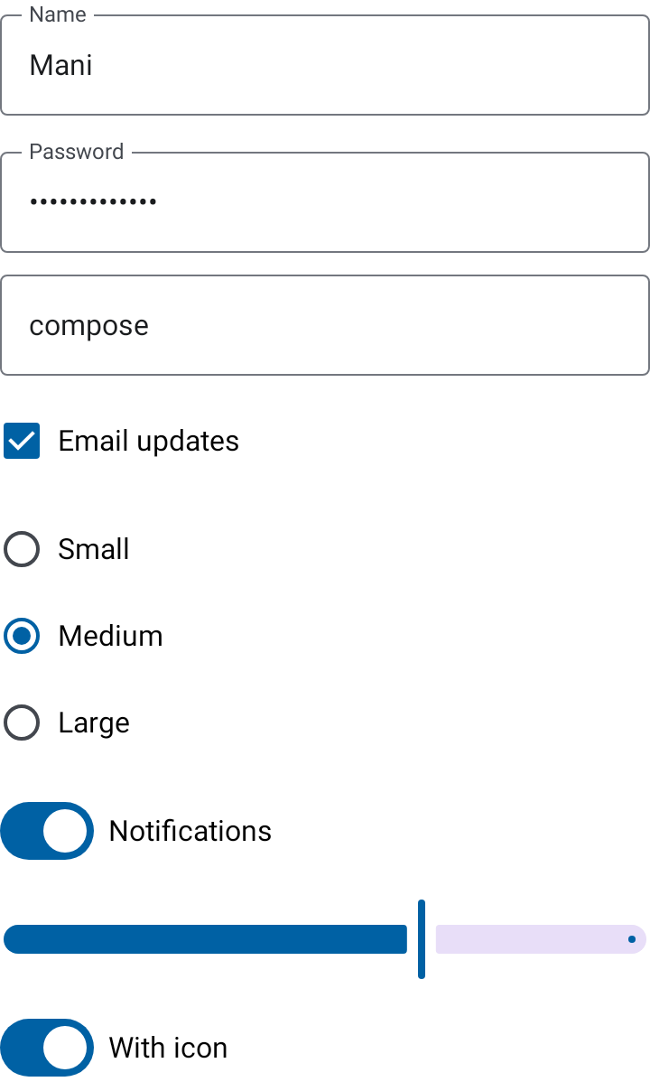
AppTheme {
    TextField(
        value = state.name,
        onValueChange = onNameChanged,
        label = "Name",
    )
}
Callers own input state and validation. Use supportingText and isError for field-level feedback.