Lists
List components cover common row and state patterns.
Components
ListItemLazyListEmptyStateLoadingStateErrorStateContentRow
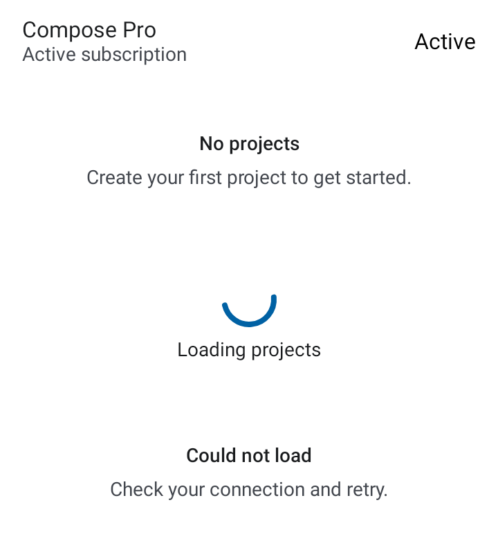
Example
AppTheme {
    ListItem(
        headline = "Compose Pro",
        supportingText = "Active subscription",
    )
}
Use LazyList for edge-to-edge compatible scrollable content and pass stable keys in item blocks where possible.
ContentRow
ContentRow is a two-line list row with a title, optional secondary/supporting text,
and leading + trailing content slots. It suits vocabulary rows, document lists,
settings rows, and similar single-tap entry points.
AppTheme {
    ContentRow(
        title = "ephemeral",
        secondaryText = "/əˈfemərəl/",
        supportingText = "Lasting for a very short time.",
        onClick = { /* open detail */ },
        trailingContent = {
            PillChip(label = "C1", tier = AppTheme.colors.levels.tier(2))
        },
    )
}
The whole row is clickable when onClick is non-null; pass null for a read-only
display. Title, secondary text, and supporting text are merged into a single
accessibility node so TalkBack reads the row as one stop rather than three.
Parameters
| Parameter | Type | Description |
|---|---|---|
title |
String |
Primary row text. |
modifier |
Modifier |
Applied to the row container. |
secondaryText |
String? |
Optional text shown inline after the title. |
supportingText |
String? |
Optional second line, truncated to 2 lines. |
onClick |
(() -> Unit)? |
Tap handler; null renders a read-only row. |
leadingContent |
(@Composable () -> Unit)? |
Optional leading slot (icon, avatar, …). |
trailingContent |
(@Composable () -> Unit)? |
Optional trailing slot (badge, icon, …). |